One of the most important principles of good design is maybe so obvious that it’s too easy to take for granted: legibility. If you want your message to be understood, make sure it is easy to read. Stay away from fancy fonts and consider making the text both shorter and larger.
When creating graphics for social media remember that people skim read when they scroll and you’re trying to grab their attention.
Everyone reads top-down and most cultures read left-right, so think about your layout carefully. Bolder fonts and strong colours can help things stand out.
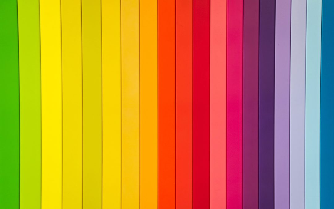
Consider which feelings or “reactions” you want to evoke. Once you have decided on the emotion, mood and tone, choose the appropriate colours. Some apps can help you play around with professionally designed colour palettes and help you choose colour groups that create harmony and balance.
Remember that content needs to be created for each platform individually, so it’s important to choose apps that allow you to quickly resize your graphics for each social media channel.
These are the tools, apps and software I personally use to make social media graphics: